Automation
The Automation Worksheet provides insights into automation rates, manual effort reduction, and time-saving potentials in process execution. By analyzing key metrics like No Touch Rate, Automation Rate, and Time Lost by Rework, users can identify areas for improvement. Interactive charts highlight manual-intensive activities and those with the highest time-saving potential through automation. Tables offer deeper analysis by dimensions (e.g. Supplier, Product Class), enabling targeted process optimization.
Type: Dashboard
Key Figures
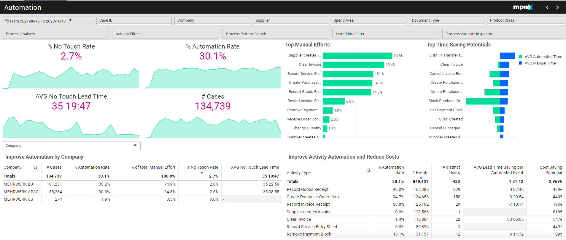
% No Touch Rate
- Represents the percentage of cases that are fully automated, meaning no manual intervention occurred at any stage.
- Ideally, a process should have a high No Touch Rate.
If this definition is too strict, remember that you can always change the definition of every PPI.
Example: In a P2P process, No Touch cases could be defined as those with automated Creation, Invoice Creation, and Payment steps.
% Automation
- Measures the percentage of automated events compared to all events.
- A high automation rate indicates a more efficient process.
AVG No Touch Lead Time
- Calculates the average lead time on cases that were fully automated.
# Cases
- Displays the total number of cases processed at the current automation level.
- Higher automation can lead to:
- More cases handled with the same resources.
- Cost savings by reducing resource requirements.
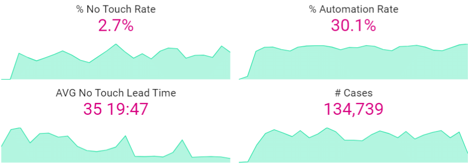
Top Manual Efforts | Bar Chart
- Displays activities requiring the most manual effort.
- Automating these activities can significantly improve efficiency.
- Selecting an item in the chart filters the KPIs and tables accordingly.
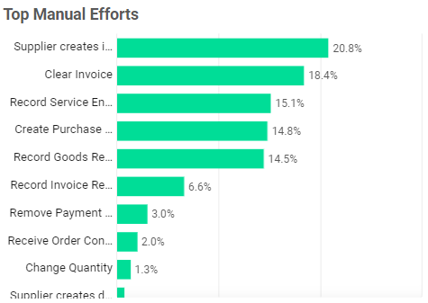
Top Time Saving Potentials | Bar Chart
- Shows activities and their frequency of manual vs. automated completion.
- Hover over an activity to view:
- Total manual time.
- Average lead time savings by automating that step (across all variants that include it).
- Selecting an activity updates the KPIs and tables to reflect its impact.
When hovering over the activity a popup will appear, showing the total manual time and the average lead time saving (across all variants that include it) by fully automating that event.
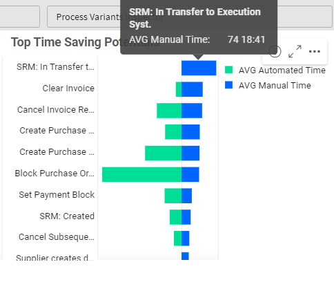
Sometimes an activity which adds a lot of lead time only affects a small number of cases and so may not have as big of an impact overall as compared to an activity with a medium lead time saving which affects a large majority of cases.
Consider prioritizing activities that affect a large number of cases for maximum impact.
Improve Automation by (Dimension) Table
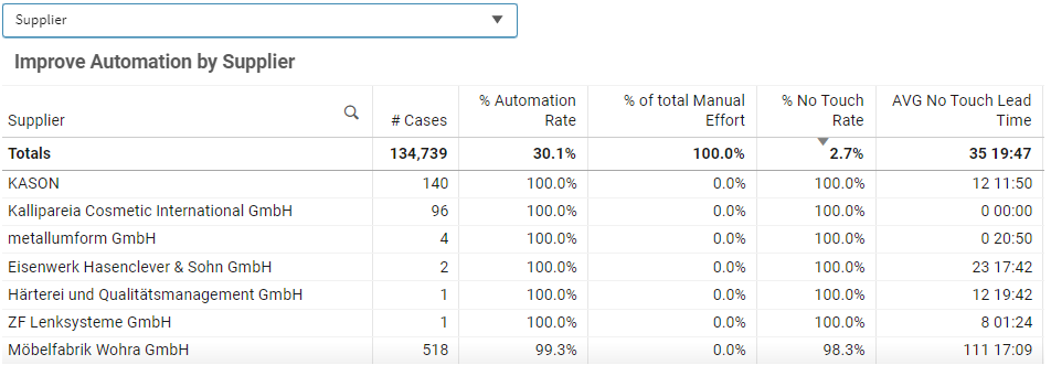
- Dropdown Selection – Analyze automation by dimensions (e.g. Supplier).
- Sorting & Filtering:
- Sort or filter by clicking or hovering over the column header you want to sort or filter.
- Identify for example Suppliers with the highest manual effort or lowest automation rates.
Improve Activity Automation and Reduce Costs Table
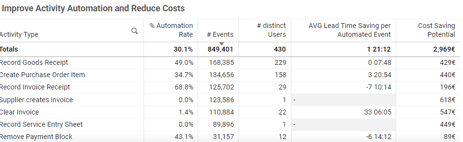
- Displays detailed information about specific activities.
- Cost Saving Potential is calculated using:
- Number of events × Duration per event × Automation potential × Cost per minute.
- This is a standard formula but can be customized based on specific needs.
Click here for more information on how to Create a Cost Calculator.